When creating the Icon component, we wanted to take in properties related to color as props and add them to the className.
The icon is made up of SVGs, and instead of specifying fill and stroke values manually, I wanted to use Tailwind CSS's autocomplete to color the className.
For example, I wanted to write the following code
interface IconProps {
  fill: string;
  stroke: string;
}
const Icon = ({fill, stroke}: IconProps) => {
  <svg className={`${fill} ${stroke} `} />
}
In order to take advantage of tailwind's autocomplete, we need to give fill and stroke different types instead of strings, meaning we need to get the names of the color classes set in tailwind.
Extracting the types
First, we can get the default color information from tailwind
import defaultColors from "tailwindcss/colors";
export type DefaultColors = keyof typeof defaultColors;

const color: DefaultColors = 'blue'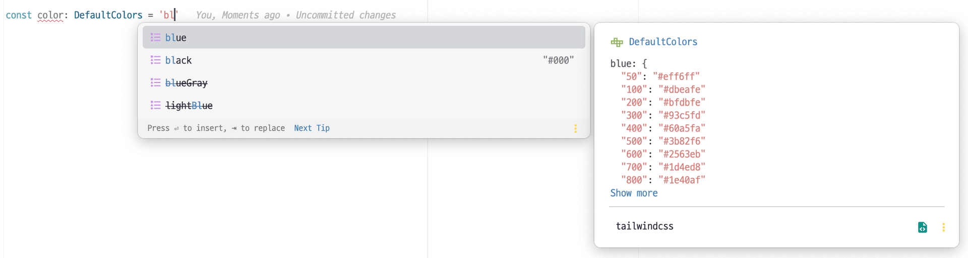
However, only the color key is autocompleted, no properties are provided after it.(blue will autocomplete, but not blue-500, etc.)
Next, let's import the full config of tailwind
import resolveConfig from "tailwindcss/resolveConfig";
import tailwindConfig from "web/tailwind.config.ts"; // tailwind configuration file

const fullConfig = resolveConfig(tailwindConfig);
From the fullConfig, we can get the following information
.png&w=1920&q=75)
Let's combine the above information to create a new type called ColorShade
type ColorShade<T extends DefaultColors> = keyof ColorConfig[T] extends
  | string
  | number
  ? keyof ColorConfig[T]
  : never;

const shade: ColorShade<'blue'> = '500'.png&w=1920&q=75)
Now we can also get the properties after the color.
Combined, we can extract a name that combines color and brightness.
type TailwindColorClass = {
  [P in DefaultColors]: ColorShade<P> extends never ? P : `${P}-${ColorShade<P>}`;
}[DefaultColors];.png&w=1920&q=75)
Apply
Now let's create a className for fill that can be in fill and a className for stroke that can only be in stroke, which is what I wanted.
interface IconProps {
  fill: `fill-${TailwindColorClass}`;
  stroke: `storke-${TailwindColorClass}`;
}.png&w=1920&q=75)
Applying custom colors
The problem with the above code is that it only imports tailwind's default colors, not the colors you define.
Separating custom colors
First, let's separate the custom colors into a single variable.
const color = {
  ...formalColors,
  ...keyColors,
  ...accentColors,
  ...grayColor,
  ...theme.colors,
}
And instead of the DefaultColors we used above, let's create the following type
type CustomColors = typeof color;
type DefaultColors = typeof defaultColors;
export type Colors = CustomColors & DefaultColors;
The final code
tailwin.config.ts
type CustomColors = typeof color;
export type DefaultColors = typeof defaultColors;
export type Colors = CustomColors & DefaultColors;
Component.tsx
const fullConfig = resolveConfig(tailwindConfig);
const colorTheme = fullConfig.theme.colors as Colors;
type ColorConfig = typeof colorTheme;
type ColorKeys = keyof Colors;

type ColorShade<T extends ColorKeys> = keyof ColorConfig[T] extends
  | string
  | number
  ? keyof ColorConfig[T]
  : never;


type TailwindColorClass = {
  [P in ColorKeys]: ColorShade<P> extends never ? P : `${P}-${ColorShade<P>}`;
}[ColorKeys];


interface IconProps {
  fill: `fill-${TailwindColorClass}`;
  stroke: `storke-${TailwindColorClass}`;
}